Posted by: Leslie Sigal Javorek • Date: Monday, November 10, 2009 12:29 am
For those of you unfamiliar with MacThemes, it’s a wonderful resource not only for finding the cream of the crop of freeware and shareware icon, wallpaper, and skins, but also a great place to go for advice on how to create such interface elements and how to improve your designs. I’ve been a silent visitor to that site for several years and just last Friday, decided to go ahead and post an announcement there of the release of my Art Deco Series of icons and included a handful of examples. To put it mildly, my offering didn’t quite get the reaction I had either expected or hoped for and it really threw me for a loop at first. But after reflecting on all the comments (over 40 to a single posting, which is more than I’ve gotten to all the posts on this blog combined!) – I realized that I needn’t be so glum. For one thing, the controversy drew a number of visitors to my blog who had not been aware of it before. (Echos of the old smart-ass saying “There’s no such thing as bad publicity as long as they spell your name right”) But more importantly, a few of the latter comments actually offered some very specific, constructive criticism. As to the hints about technical execution, I am reminded that not all users have the same set-up as I (I’m working on a MacBookPro, OSX 4.11, 1920×1200 resolution with millions of colors on a matte-finished LCD screen and have all my Finder views set to 128×128 icons) – and so need to make sure that my icons look good at ALL sizes and all possible resolutions. Before I was forced to retire, I wouldn’t have thought twice about investing whatever was necessary to keep current with the tools of my trade but without any means for a return on that investment, I’d been reluctant to upgrade to the Leopard system which actually uses the 512×512 size as well as 32-bit graphics because I wasn’t sure I could justify the cost of having to likewise upgrade most of my software. This is something I need to reassess.
As to the comments that said my icons looked “dated”: The difficult part is trying to figure out how to meet the marketplace trends without having to give up my own personality in the process. I had always thought that the idea of third-parties creating icons for use as alternatives to the originals embedded in their operating system and applications was to give a choice for those who wanted something more distinctive. Yet if the perceived quality of those 3rd party icons is substantially based upon their compliance with this month’s committee-determined color palette and Apple’s or Microsoft’s chosen viewing perspective and lighting effects, then don’t we just end up with cookie-cutter icons that have barely perceptible differences from the original? And how does one fit within the confines of the latest trends even when trying to depict a specific historic period and style?
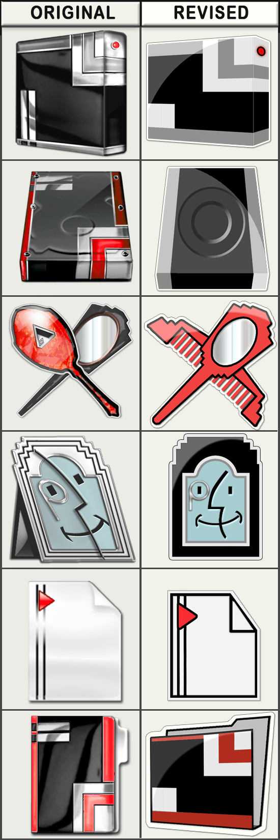
I’ve got a lot to mull over, research, experiment with, and hopefully will improve. I made a first stab at it over the weekend as you can see from the following side-by-side comparison. (Don’t bother trying to download this preview as there is no release at this time on the revised version as it’s just at the beginning stages – but if you’ve got any thoughts on these, preferences, constructive criticism, etc. I would love to hear from you in a reply to this post.)

As for tonight’s offering of downloadable icons/clip-art, I’ve created the following half dozen specimens that can be used on your desktop for Twitter – or wherever else that might strike your fancy. Enjoy!
Free Clip-Art / Icons of the Day
The following images are either full or reduced size previews. Simply right-click (or control-click) on the preview to save the image(s) of your choice to your desktop. (Unless otherwise noted, downloads are 512px X 512px in .png format). As always, usage of any of the images offered in the “Free Clip-Art / Icons of the Day” section are free for your personal use, subject to the limitations of my Creative Commons Non-Commercial – Attribution – No Derivatives – Share Alike- 3.0 license. (See sidebar for Terms of Use) For commercial or any other use, please contact me for directly.
 —
—
 —
—
 —
—